
Most LinkedIn vs. cold email comparisons rely on vendor benchmarks or a single case study stretched into a rule. We wanted to see what our own campaigns showed, so we pulled the numbers from five active client programs and compared the two channels where we could.
This post covers what we found, where the data is strong, where it is thin, and what we would and would not conclude from it.
What’s in the Dataset
- 5 B2B clients from different industries: MLOps/SaaS, contract metal manufacturing, an SEO/marketing agency, legal tech SaaS and corporate VR/XR training SaaS
- 3 clients ran LinkedIn and cold email on the same accounts, which gives the cleanest comparison
- 2 clients ran email only in this dataset, included to show how much reply rate varies by industry
- Campaign counts ranged from 5 to 65 per client, and email volume from about 8,000 to 115,000 messages sent
- Date ranges differ by client, from a few months to nearly two years
This is not a controlled experiment. These are live programs with different offers, lists and messaging, so the numbers show what happened in practice, not what would happen under identical lab conditions.
Two Metrics, Not One
- Reply rate: the share of messages that got any response, including “not interested” and “please remove me”
- Positive reply rate: the share that got a genuinely interested response, which is what feeds pipeline
A channel can win clearly on the first and only slightly on the second. That gap turned out to be the most useful finding in the data, and it’s part of why we treat reply rate on its own as an incomplete signal, something we go into further in 7 outbound metrics that actually matter.
The Full Picture
| Industry | Channel | Campaigns | Messages sent | Reply rate | Positive reply rate |
| B2B MLOps / SaaS | 23 | 21,986 | 2.3% | 0% | |
| B2B MLOps / SaaS | 20 | 2,488 | 3.0% | 0.84% (21 replies) | |
| Contract metal manufacturing | 5 | 9,820 | 3.5% | ~0.7% (estimate) | |
| Contract metal manufacturing | 5 | 1,624 | 3.7% | 1.35% (22 replies) | |
| Corporate VR/XR training SaaS | 65 | 115,612 | 1.01% | 0.39% (451 replies) | |
| Corporate VR/XR training SaaS | 20 | 10,183 | 6.6% | 0.79% (80 replies) | |
| SEO / marketing agency | 13 | 8,122 | 0.8% | ~0.09% (estimate) | |
| Legal tech SaaS | 48 | 83,202 | 1.16% | 0.17% (139 replies) |
Finding 1: LinkedIn Won on Reply Rate in Every Head-to-Head
- MLOps / SaaS: 3.0% vs. 2.3%
- Manufacturing: 3.7% vs. 3.5%
- Training SaaS: 6.6% vs. 1.01%
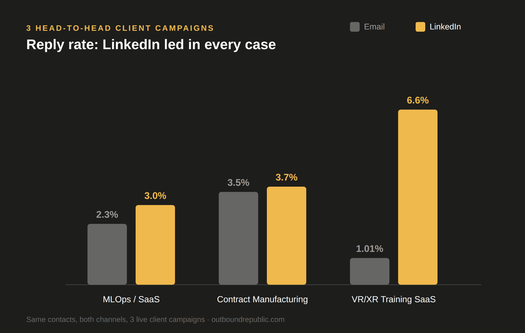
The direction was consistent, but the size of the gap was not. In manufacturing the two channels were nearly level. In training SaaS LinkedIn replied about 6.5 times as often as email.
That spread matters. A fixed rule like “LinkedIn gets X times more replies” would have been wrong in at least two of the three cases.
Finding 2: Industry Moves Reply Rate as Much as Channel Does
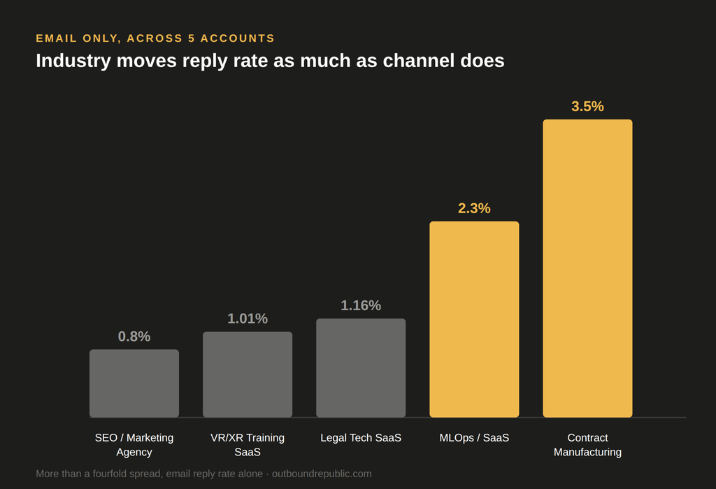
Looking only at email across all five accounts:
- Lowest: 0.8% (SEO/marketing agency)
- Highest: 3.5% (contract manufacturing)
- In between: 1.01%, 1.16% and 2.3%
That is a more than fourfold spread on a single channel. The gap between the best and worst email result in this dataset is larger than the gap between email and LinkedIn in two of the three head-to-heads.
Two practical consequences:
- A benchmark quoted without an industry attached tells you very little about your own market
- Comparing your email reply rate to a generic “average” can make a healthy campaign look broken, or a weak one look fine, a trap we’ve written about in the context of validating a new ICP before scaling spend against it
Finding 3: Positive Replies Tell a Different Story
Reply rate counts every response equally. Positive reply rate separates real interest from noise, and the comparison changes:
MLOps / SaaS
- Email: 2.3% reply rate, no positive replies recorded
- LinkedIn: 3.0% reply rate, 0.84% positive
- Here LinkedIn was the only channel that produced qualified interest
Contract manufacturing
- LinkedIn’s positive rate (1.35%) was roughly double email’s (~0.7%)
- That is a bigger relative gap than the reply rates (3.7% vs. 3.5%) suggested
- A near-tie on replies hid a clear difference in quality
Corporate training SaaS
- LinkedIn’s reply rate was about 6.5x email’s
- Its positive reply rate was only about 2x email’s (0.79% vs. 0.39%)
- A large reply rate lead overstated the real advantage
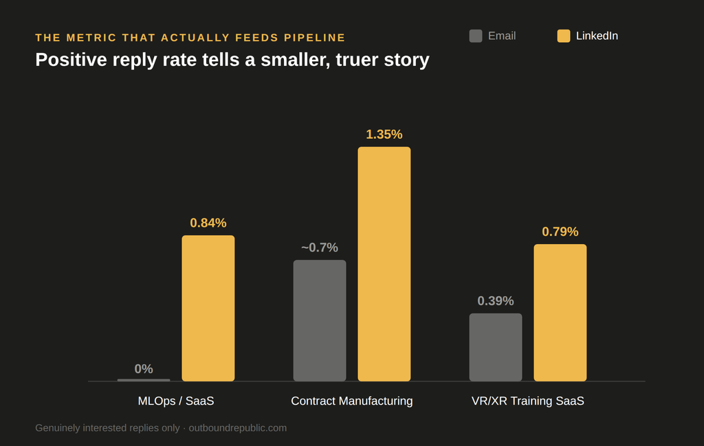
So reply rate overstated LinkedIn’s lead in one case and understated it in another. Neither number alone is a reliable guide to which channel is working.
Reply rate is the number everyone screenshots, and it’s the one I trust least on its own. The manufacturing account is why: reply rates were almost identical, 3.7% versus 3.5%. If we’d stopped there, we’d have called the two channels equal. Once we checked which replies were actually worth a follow-up, LinkedIn’s lead nearly doubled. That’s the number I actually look at now, not the headline one.

Why the Pattern Might Look Like This
We can’t prove causes from five accounts, so treat these as reasonable hypotheses, not findings:
- LinkedIn messages arrive in a context where the sender is visible. A prospect can check a profile, role and shared connections before replying, which may make both polite declines and real interest more likely.
- Email reaches a colder, larger audience. Higher volume tends to bring more irrelevant or automated responses, which count as replies but not as positive ones.
- Audience matters. The wide gap in training SaaS and the narrow one in manufacturing may reflect how active each buyer group is on LinkedIn, not anything about the channels themselves.
An Important Caveat on Volume
LinkedIn volumes in this dataset are much smaller than email volumes:
- MLOps: about 2,500 LinkedIn messages vs. about 22,000 emails
- Manufacturing: about 1,600 vs. about 9,800
- Training SaaS: about 10,000 vs. about 115,600
Smaller samples are noisier. A positive reply rate built on 21 or 22 replies can move noticeably with a few more or fewer responses. That is another reason to read these results as a direction, not a precise measurement.
What to Do With This
- Test both channels on the same audience before committing budget. LinkedIn led every time here, but the size of the lead varied too much to assume in advance.
- Track positive reply rate, not just reply rate. It is the metric that connects to pipeline, and as the training SaaS case shows, the two can tell different stories.
- Benchmark against your own industry. If you compare against a generic average, you may draw the wrong conclusion about whether a channel is working.
- Don’t treat the channels as either/or. Different channels reach people at different moments, and the data here is about how each performs alone, not about what the two do together, we’ve seen email and LinkedIn combinations outperform either single channel in practice.
- Check the quality of your reply tagging. Positive reply rate is only as good as how replies are classified. A campaign with plenty of replies and none marked positive is worth auditing before drawing conclusions.
Message quality still does a lot of the work regardless of channel, see cold email copywriting: what makes a message actually get replies and how to open LinkedIn conversations that don’t feel like spam.
FAQ
In these three head-to-head client campaigns, LinkedIn led on both reply rate and positive reply rate every time. But the size of the lead ranged from nearly nothing (manufacturing) to very large (training SaaS), so treat “LinkedIn wins” as a direction to test on your own audience, not a guaranteed outcome.
Reply rate counts every response, including declines and unsubscribe requests, equally with genuine interest. Positive reply rate isolates the replies that actually feed pipeline. In this dataset, a channel’s reply rate advantage sometimes overstated and sometimes understated its real positive reply rate advantage, which is why both metrics need to be tracked separately.
Significantly. Across five accounts in this dataset, email-only reply rate ranged from 0.8% to 3.5%, more than a fourfold spread. That range is wider than the gap between email and LinkedIn in two of the three head-to-head comparisons, which is why an industry-less benchmark is a weak basis for judging your own results.
What This Data Doesn’t Cover
This dataset covers reply rate and positive reply rate. It does not yet include:
- Time to reply
- How replies converted into booked and held meetings
- Cost per positive reply by channel
All three matter more than reply rate for judging real pipeline impact. We are tracking them and plan to publish a follow-up once we have enough campaigns to report on honestly.
If you want a read on how LinkedIn and email would likely perform against your own list, get in touch – a small head-to-head test is usually the fastest way to get a real answer, and it’s the same approach behind our cold email and outreach programs.
Related: LinkedIn vs. Cold Email: Which Outbound Channel Actually Performs Better?, Multi-Channel vs. Single-Channel Outbound